
Learning Lettering in 2022 - Imitating Brush Script Lettering with a Pencil

So many resources, so little time...
Lately, I’ve been getting a lot of requests for how to do (insert a lettering topic here). I’m going to probably be chastised in the future for writing this at some point…But I believe that there are soooo many great resources out there that I just don’t think I have anything unique to add to all that at this time.
Yes, I knooowwww I’m a teacher y’all…and everyone is unique and unicorns and butterflies.
I just feel like the Library of Google and Youtube University have you covered over and above anything I could ever fit on my blog…and I don’t know that that was always true.
Years ago, when I first developed an interest in lettering, there were only a few classes and resources on the topic. I still have access to my first Learn Lettering class by Sean McCabe…which I still have to take. 😬 In my defense, I was on a career-finding, kid-raising grind at the time. Back then, his was the only comprehensive class I could find on the topic…and he probably kickstarted many of the big name, lettering entrepreneurs you see today. But, here in 2022, the lettering community is SO huge. There are a ton of resources from free to paid to choose from. You can find practically anything you’d want to on lettering.
Still I also believe, even with Google and Youtube, that I do owe it to the folks who are following my personal journey to respond or guide them to answers as best I can. It’s my only way to thank them for consistently stopping by any of my little spots on the web. For them, I occasionally add a how-to in a weekly blog update that I send out. If you’re interested in those, feel free to sign up for them at the bottom of this page. But, I will also attempt to share what I know here on the blog from time-to-time, when there’s time…And if you stick around until the end of this blog post, I will let you know about the places I frequent to learn!
So let’s get started!
Today’s request was about giving a tutorial on the lettering I did for New Year’s Day. I didn’t record myself lettering that (womp, womp)…and there are a few parts to that piece-the lettering, the vectoring and the embellishing. While I can’t go back and do that piece all over again, in this post, I’m going to focus on the first part of the process…the lettering and how I would have done that behind the scenes on a piece like that.
The Truth About Brush Lettering with a Pencil
You can’t. A pencil will never be a brush pen, period.
But…you can come awfully close to the appearance of a brush pen using a pencil. That’s how I achieved the lettering in this piece.
Read on.
The First Thing To Know About Lettering
One of the first things to learn about lettering or handlettering is that it’s part of a threesome that are often used in design. They are lettering (also called handlettering), calligraphy and typography.
Lettering is the art of drawing letters.
Calligraphy is the art of writing letters (typically where the tool is key to the mark that is created).
Typography is the art of arranging typefaces and characters and type design usually refers to the art of designing typefaces (think of all the typefaces or fonts you use on your computer).
The work I typically show falls under the umbrella of lettering - drawing letters. But, lettering can often be informed by letters formed by calligraphy and various typefaces.
I certainly have my favorites. But, I enjoy attempting to mimic a variety of styles with a pencil. Sometimes, it’s a vintage typeface I’ve seen before or gothic calligraphy…or even graffiti. For instance, in the piece I did for the New Year, I was using my pencil to imitate a very casual form of brush script lettering or brush calligraphy. I didn’t use a brush at all in any part of the process, however, aside from the Procreate brushes I used to trace it.
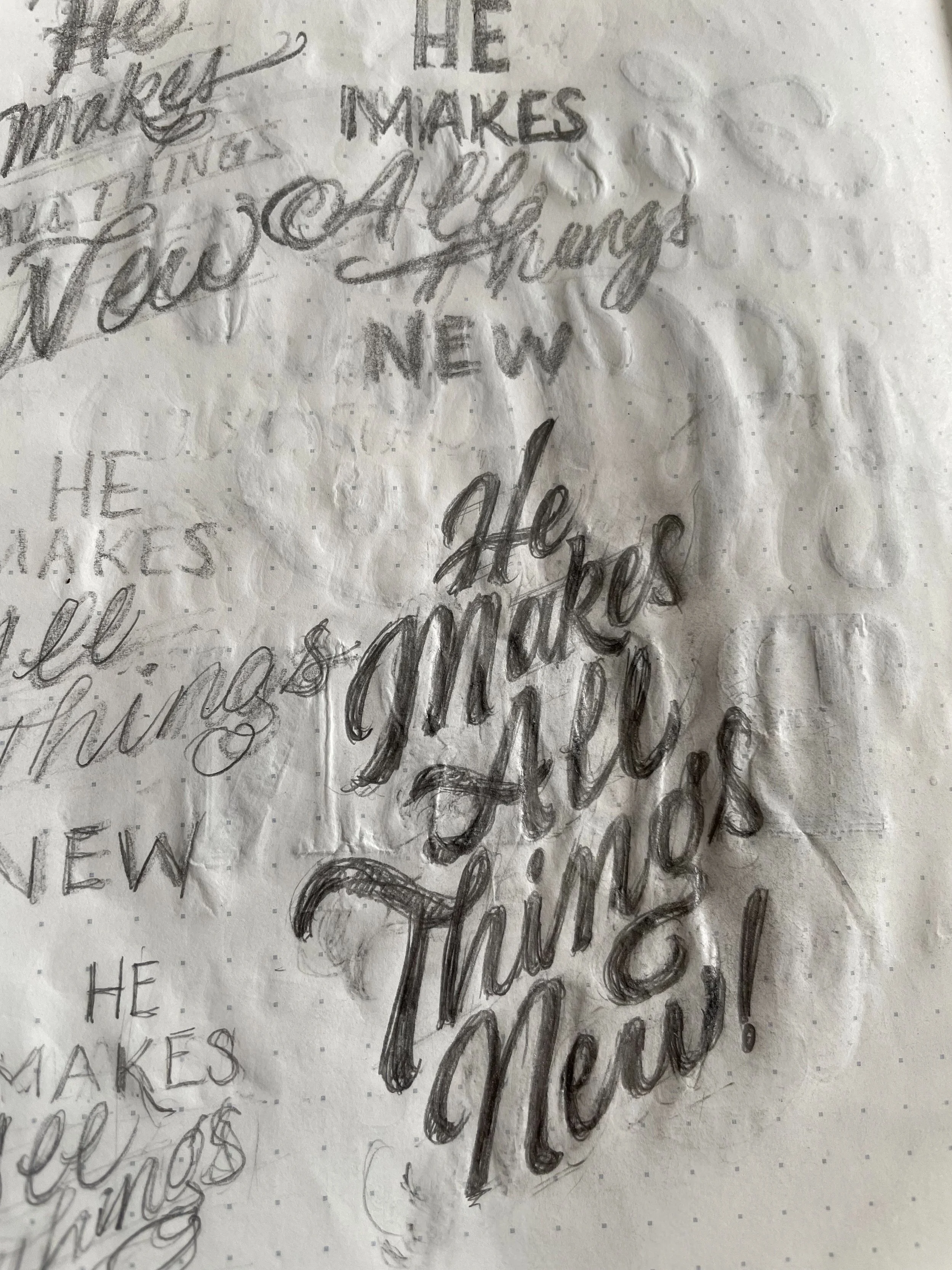

My original sketch, of course, changed through the refinement process on my iPad (see the side-by-side comparison below)…and looking at it today, there are yet things I would change. But, for now, I just leave those things there as a record so that I can remember to look for them the next time I try something similar down the road. It’s all about growth!

Brush Lettering with a Brush Pen
Brush script is one of my favorite forms of calligraphy. Although there are many kinds of script styles, to me, brush script has a very modern, yet relaxed expression to it and tends to fit into an informal composition like a well-loved pair of jeans. In brush calligraphy (or any form of calligraphy I know of, for that matter), the downstrokes are thick and the upstrokes are thin…and with the brush, you can achieve many expressive types of strokes to give additional character to your piece.
The basic strokes are well-known and are used to make full letters along with connecting strokes that make full words. Even before starting a piece, giving the basic strokes 10-20 minutes of practice helps to warm up your hand and get that muscle memory working (shout out to @20MinutesofCray!).
Check out this video on the Happy Ever Crafter YT Channel with Colin Tierney the founder of Crayligraphy and Natalie Downey, for learning brush calligraphy with the ever-accessible broad nib marker. Here is a very generous video with some tips on beginning brush lettering with a brush pen by Crayligraphy member, Mikaela Jolie from The Rebel Neon. Lastly, if you are short on time, here’s a beginner brush lettering tutorial by Becca Courtice of The Happy Ever Crafter.
Imitating Brush Lettering with a Pencil
Of course, most people know that my tool of choice to start anything is usually a pencil anymore. They are easy to use, easy to erase and don’t tend to get on my clothes at work no matter how accident-prone I am. But, even though I don’t show it as much as when I first started lettering, I still practice brush lettering from time to time in my planner or on scrap sheets if I have a marker or brush pen nearby. Most often, this happens at work where we have a plethora of broad line markers or I can sit for a few on morning duty. I find this kind of practice to be really valuable for lettering since, over time, you can learn to mimic what you’ve done in your practice with other tools. In fact, the more I can notice in practice, the more easily I can attempt to draw something that approaches a more authentic looking brush calligraphy style, even if I don’t have a marker on hand.
You can see below where I lettered the words ‘Brush Lettering‘ in pencil.

To me, I consider this faux calligraphy. But, most times, with faux calligraphy, we work with an outline of the letters where the strokes are all drawn in. I use this method sometimes. But, most often, I tend to start with just writing the word out and building up the strokes by…well, more strokes and scribbling…(get it, Stacey Scribbling 😉).
As I’m building up the bulk of the letters, I shape the outline of the letters as I go. Of course, when I’m trying to give something a little more finish, I try to neaten it up with refining and hatching and whatnot…Or I take it digital, etc. But the tone of strokes and scribbles help me bulk up the forms to see the positive and negative spaces better and to know when I need to add space at an earlier stage than I would with traditional faux calligraphy (can I call it that?). Traditional faux calligraphy with its hollow insides of the downstrokes doesn’t give my eyes a great idea of weight. It’s important to note that this works for ME. Do what works for you. If you are a blog update subscriber, you will see a short video version of this in the next blog update.
For this ‘Brush Lettering' example, I did not start with a brush-lettered sample, and sometimes this works fine, especially when working smaller. But, if I ever feel like something is off to what I think it should look like, going back to practice with the actual tool helps me. Usually, any super huge visual disconnect in lettering where you’re mimicking an actual tool is because either your stroke consistency is off, or your angle of inclination may be inconsistent (hello, Stacey 🙋🏾♀️), or the tool may not be able to do what you’re trying to mimic, etc.
Below, I used an actual brush pen to see differences between how my memory served me versus how the tool actually works in real time.

You can see here my letters with this brush (Pilot Petit 3 Mini Brush Pen) would have been more elongated and there are differences in how the letters take shape that I can always factor in the next time I tackle this kind of project, pencil-only.
The times when I fall back most on faux calligraphy is if I’m having trouble trying to visualize the shape of what those strokes might actually look like using a tool I’m trying to imitate. In those cases, it might be better to go with the outline of the strokes first (or to go back and forth between the outline and building up form with strokes and scribbling) so that you can drill down on the shape until it looks credible.
For instance, I used more faux calligraphy for the title drawing of this post and went back and forth between that and strokes and scribbles until I got something I liked. This one was difficult to visualize since the only tool I know that thick that I’ve ever worked with is a Tombow Dual Brush Pen and I don’t use it that often. But, I think that this sketch could be something of what I might see with it. When I got what I wanted, I committed to the edges, darkening them and erased all the insides out. Voila! Faux calligraphy!
You can see in the close up where I had connected the capital ‘O’ and the ‘n’. But, I wasn’t convinced. So, I ended on the other version.
Naturally, the only way to get better at doing this with a pencil is by practicing with the real thing often enough to get better at it, to know what the tool can actually do, and to know what your lettering would look like with an actual brush pen (or whatever tool you want to imitate). Then, trying to recreate that from time to time. I liken this to how fine artists who draw the human figure from imagination have often drawn the human anatomy from life so much that they can recreate it two-dimensionally with credibility and accuracy at whim. It takes a lot of time and dedication to get to that point. I feel the same about type anatomy. This is my second year of sustained focus with this craft and I can say that there’s still so much to learn.
Adjusting and Refining Your Lettering
No matter how close I come to brush calligraphy, even if I started it with an actual brush pen, I find my work still needs to be refined afterward.
Enter a tracing tool.
Refining for me means to try to get as close to consistent marks as I can in my brush calligraphy or mimicking of brush calligraphy without completely stagnating the piece (I mean, we want it to have some life, right?). For this, if there’s time, I use tracing paper. But, many times, since there’s not, I use my iPad and the Procreate app. The tools may be different, but the process is still the same for me.
Start with the best piece from practice.
Cover it with a sheet of tracing paper or open the drawing in a new canvas in a drawing app like Procreate. If you’re in an app, lower the opacity of the original drawing and lock the layer. Then, add a layer on top. This gives the semblance of tracing paper.
Trace the design (these days in Procreate, I use a monoline brush), correcting errors, adjusting edges and marks for consistency. Refer to an actual piece of brush lettering, if necessary.
Sometimes, in the Procreate app, I like to try using a brush that is meant to simulate brush calligraphy over my locked original to see if my lettering is logical. But, it’s better, in my opinion, to use the actual pen to check my pencil work since Procreate brushes are also to “simulate the behavior of” and may not actually be 100% accurate themselves.
If you’re satisfied with your work, that’s great! You can move on from here to vectoring or embellishing if you like. But, if not, you can always play with your lettering to your liking. Ideally, all the playing with letters would be done before finalizing the work…But, there’s no harm in pushing a drawing if you think that it could be better before you call it finished. Just add another layer and get to work.
You can see how I refine pencil sketches digitally in my process videos on YT like the one below.
Also, see this tutorial of Adam Viceral refining using tracing paper.
Resources for Taking Your Lettering To the Next Level
I promised to list my favorite places to learn lettering. But, after getting this far, I felt developing a list that you’d have to dig into the blog to find should you need to return would be less helpful than just adding a page for it. So, without further ado, here’s that list on a shiny, new page of its own. I’ve added a few other items on there as well that might be of use. Enjoy!
If this post was helpful to you, let me know. Comment on the ‘gram or drop me an email any time. 👋🏾
