
Affirmations and an iPad Lettering Tutorial
Words do matter...What you tell yourself matters.
In my quest to add more handlettering to my day, I have also taken it upon myself to give some not-so-subtle hints to a new-to-me student and young lady that I found to be down on herself.
Truth be told…it’s likely she’s not the only one.
While every generation seems to have its own vibe, some things never change…and that is the need for students to understand how to develop healthy relationships with one another. However, when wounds cut deeply, sometimes teachers need to leave the job to counselors for the heavy lifting. Unearthing things that can’t be resolved in the typical classroom setting can actually do more harm than good if they are not followed through by the proper channels.
Still, it’s common to see students with such a lack of personal power that they have to be restored, in a sense, by an authority figure like a teacher until they can get there on their own. Teachers can help all students develop coping skills that promote resiliency like using words of affirmation and self-talk that helps to develop a growth mindset.
So, the way I have been helping with all that is through a little message in a cardholder on my desk.
I love it. It can only fit small cards, so it’s a much smaller investment of time that can be done in small snatches of the day. Plus, it gives me a way to encourage my students as well as practice my lettering in any way I choose that week; I can go from free-styling, trying out natural media that I don’t get to regularly use; I can play with color; I can perfect my prints…all in a bite-size, miniature format. I may have to keep tiny, elementary fingers from walking away with it from time-to-time.
Small price to pay. 🤷🏾♀️
While most of these I intend to be done at school, this one,I chose to complete on the iPad since another lettering artist friend requested I do a tutorial.
Lettering on the iPad…a Tutorial
I gotta admit, I’m a little squeamish since there are a million lettering artists that have excellent tutorials on this topic and I feel most comfortable in the process video only club. But, most artists find out how others do things and then pick and choose pieces from the processes that resonate with them most until they develop their own. I figured I could cobble together a few helpful visuals that might help with an iPad process since this particular lettering artist is mainly a natural media girl.
That said, there are myriad approaches to doing this. Many lettering artists have a process that begins and ends with the iPad. I started lettering that way. Eventually, I found a hybrid process worked better for me. Your results may vary.
First, while it may sound obvious, I have to include this…I wholeheartedly suggest an iPad that works with an iPad Pencil. While I used to produce art on an iPad with my fingers back in 2010 when they were first introduced and the Apple Pencil was just a twinkle in Steve Jobs’ eyes (and, technically, it could still work for painting apps) I don’t recommend it for lettering at all.
Once that’s out of the way, the next steps might be of help to the natural media artist that finds the iPad to be a challenge….

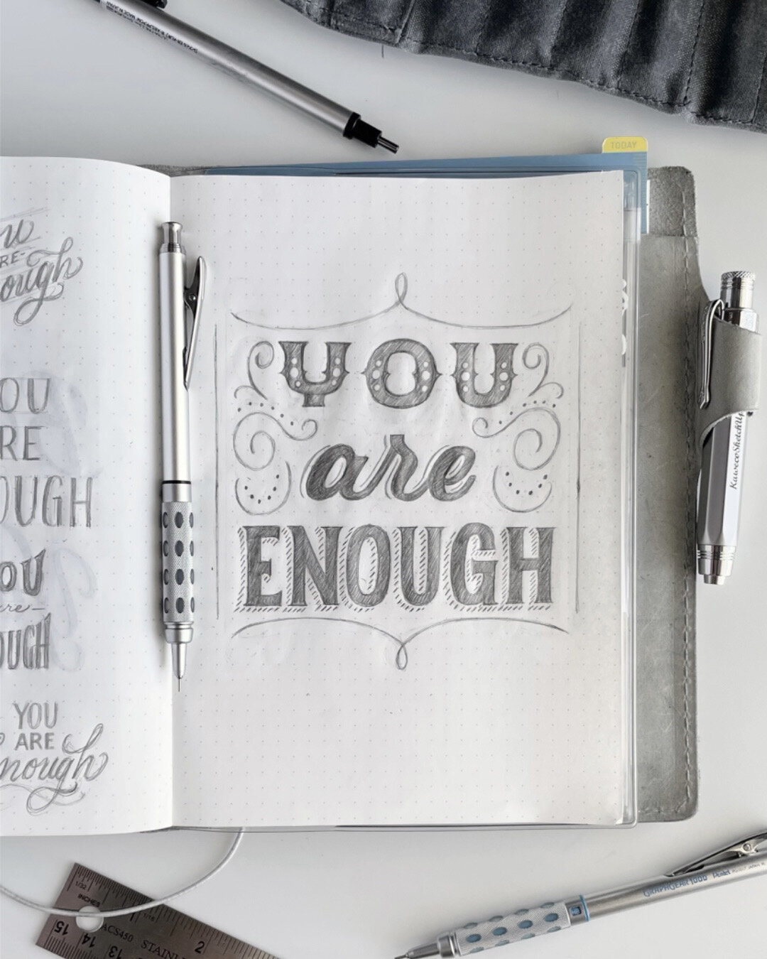
Draw it on paper first.
I find that working out the majority of my ideas before I approach the iPad works really well for me. I use pencil and paper most. But, I wouldn’t be above doing the same with pen or even a water based media, depending on what I wanted to do. My first reason for this is because I just like the feel of it…and mentally, it’s a much less restrictive process for me than starting in a digital environment…
I understand that that’s a little oxymoronic given that you have access to tons of colors, textures, backgrounds and more on the iPad than what a piece of paper and pencil could give. But, to me, all of that is part of the restriction. I’m an undisciplined soul when it comes to options. The more I have, the more I’ll try. So, I like to start my drawing without all the extras so that I can see how far I can take it and how strong I can make it before I start adding in the fluff. Chances are, if I don’t like it in its simplest terms, I’m likely not going to like it with a bunch of bells and whistles either…and I will have saved myself a lot of time and fruitless experimentation.
Still, another really good reason for this is that I don’t use a screen protector. Working with pencil and paper helps me get things placed where I want them without worrying about slipping and sliding over the screen of the iPad too much. By the time I start drawing on the iPad, my lines serve as a guide for where I initially feel they should be and I can make adjustments from there. Please note that there are screen protectors that will help give some resistance for drawing from beginning to end on the iPad…so don’t let my habits stop you from trying that out. You might like it!
Take a photo of your drawing.
Place your drawing on a flat surface. Arrange your camera lens above the drawing, parallel to it. Be sure to get the whole drawing in the frame. It honestly doesn’t even matter to me how much of the surrounding area I get into the frame because it can be cropped out later. See the above photo for the original photo. See the photos below for how far I cropped into the photo. Note that due to how paper curves and what not, depending on the kind of paper you use, your drawing could still be distorted in some ways or have to be adjusted for some other reason later. But, that can be resolved on the iPad…See #5.
Upload the photo into a drawing program.
I use Procreate. But, I’m sure there are other comparable programs for this process. You just want it to be able to incorporate layers, opacity, some editing functions, etc. Still, in Procreate, I’d upload the photo as is. Alternatively, in Procreate, you can also pre-determine the size of the canvas first and then upload the photo to that canvas. This is great for when you know how you will share your work and if there’s a certain aspect ratio needed for it.
Lower the opacity of the photo and lock the layer.
When you are using a drawing as a guide, you want to be certain that you can see what you are doing. Lower the opacity of the drawing. You won’t be drawing on the layer with the drawing because you want to keep the original just in case you need to go back to it. You just need to be able to see the edges of your drawing clearly. You can see in the top left photo below where I have duplicated the first layer. The original layer is locked and out of sight. But, I used the duplicate to manipulate the words a bit before I continued…which brings me to my next step…
Choose how you will keep your letters in proper alignment using grid guides.
I like to use the grid given in Procreate and/or the Grid Builder to keep my letters aligned. (Try to be mindful of the midline of your drawing. It’s easy to fudge up if you don’t zoom out from time to time.) In the beginning, you can put your guidelines on their own separate layers so that if anything needs to move at a later time, you can do it more easily than selecting and moving, resizing, etc. Place the guides according to your drawing and then group them. If you notice any irregularities where the drawing isn’t fitting properly into the guides, take the time to make adjustments. For example, when I use a rectangular guide around a block of lettering, if some of the letters don’t touch the top or bottom line of the guides, I can go back, select the original drawing layer (duplicate, lock, and hide this layer first-only make adjustments on a copy) and distort or increase the size of the section(s) I need. See the difference between how the letters fit inside the grid guides in the third and fourth photos below. Honestly, these letters are pretty straightforward and can be adjusted in the actual tracing process…But, say for a wavy grid guide or some other more complex shape, this tip comes in handy. Conversely, if the grid guide doesn’t fit the shape of your lettering (and the shape is very specific to the drawing - like your letters are in the shape of an oval that doesn’t quite fit the oval grid guide you have), distort or resize the grid guide to suit the letters. I found that I wanted to space the word “You” up a bit more than what I originally had as well as some letters in “Enough” a little later in the drawing. So, I did that in my duplicate layer rather than my original layer. You can see in the top photo on the right where there’s a crack in the drawing around “You” where I moved it.
Lower the opacity of the guides and lock the layer.
Yup. If you haven’t already, once your grid guides are in place, flatten them, lower the opacity and lock the layer.
Trace your drawing.
On a new layer, with a digital brush of your choosing (or a monoline brush for smoother lines and easier color dropping in Procreate), start tracing your drawing. It’s a lot like tracing paper, with undos. I trace the outlines of my letters and fill them with black. Understand that the guide drawing doesn’t have to be set in stone. If you notice things you can improve on while you’re tracing, just go ahead and do it. You still have the original if you find that you want to revert.
Now for the fun part!
Use clipping masks to color the various pieces of your drawing and make adjustments as necessary to finish your drawing. I’d like to say that this can get so fun that you can lose your place and ruin parts of your drawing that you may not be able to recover easily or without starting over. So, often, I like to keep sections organized as I work. It’s a personal choice…But I think it pays in spades. As I work through a drawing, I trace words on separate layers in case they need to be moved around or nudged later. I also separate out embellishments, etc. Then I group and rename them as I go. This all gives me a lot more control later when it’s time to add color or texture to the letters and various embellishments. You can see the final layers below, just above the final drawing.
Keep refining your process.
Of course, there’s always human error to spoil even the best of intentions with your final drawings on an iPad or any other surface. You can see that my ‘N’ in the final drawing has a stroke that’s thicker than the other letters. There are times when I would correct that like if it were for a client or something that would be sold. Regardless, handwork always involves….well, the hand. This is where you just keep going, refining your process and letting that piece just be what it is as you learn to work with the iPad. It’s totally okay. Your iPad won’t even care.


So, that’s my process and I hope it helped…and just for kicks…here’s the process video to go with it.
Let me know if this was helpful for you in the comments or on my social media outlets…and enjoy the process.

